Art Criticism
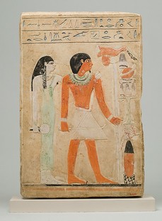
This piece is called Stela of Dedu, artist unknown, and it depicts Dedu and his wife, with them both staring ahead and Dedu holding a staff of some sort, with a stack of various items painted right next to it. There are also hieroglyphs engraved right above Dedu and his wife. The title of this painting tells you that this is a painting of Dedu, and that it is done on a slab of stone, which are both things that have very simple interpretations, as the title just states what it is. This painting was created by the picture first being drawn out on stone, then engraved, and after being engraved into the stone, it was painted over.
The lines that are used in this painting are very clean, with many straight and softly curved lines. However, due to the many straight and soft-curved lines, the humans in the painting look fairly stiff due to the lack of more line variety. There isn’t really any value at all in the painting, and all the colors are painted as solid colors without any shading or color value. Space was used in the drawing as the blank space behind Dedu and his wife, which helps make the drawing not feel too busy, and pleasing to look at. However, since the faces of the two humans in the painting are so emotionless and cold, it is hard to determine the mood of the drawing, if there is one at all, and their bodies don’t really have a feel of energy and movement to them. The three main points in the painting, Dedu, his wife, and the stack of objects, are well balanced across the painting, and those points are spread out fairly evenly, which created a nice balance to the painting. The proportions in the painting are fairly good, and overall are not out of balance with the objects in the painting, or the other human in the painting. There is not much pattern in the painting, although you could consider the faces of Dedu and his wife as pattern, since they are both so similar to the point of repeating. The movement in the painting flows well. First, you will most likely look at the two humans in the painting, which are staring straight ahead right at the stack of objects. This helps your eyes move across the painting and see the three main focal points in the painting. There is a sense of unity in this piece, as the colors are all very similar, and the humans have similar emotions, which helps unite the painting. However, due to the uniformity, there is not a large amount of variety. You could consider the stack of objects to have variety because each item has a unique shape to it.
I interpret this artwork as being a painting to depict a ceremony of some sort, mainly because of the staff that he is holding in the painting and the stack of various items. This could be an offering of some sort or possibly a funeral ceremony for somebody. However, I also think this may possibly be a depiction of normal life for him, since his wife is right there with him, and the stack of items may be his own personal belongings.
Overall, I think this painting is well done, especially for the time period it was painted in. However, it does need more line variety, in order to decrease the stiffness in the humans, and create more movement and energy. I also believe that more value and color should have been used to make the painting have more noticeable and vibrant colors. This piece should also have more of a sense of variety, like showing the humans with different emotions or in slightly more different poses. Since the mood is so difficult to determine due to the emotionless expressions on the face of the humans, I believe that this is yet another reason to give both Dedu and his wife more complex emotions. But as for the other elements, this painting accomplishes them very well, and that this painting represented many aspects of art in it very well.
Art History
Inspiration Hallway
"Who is the influencing artist(s) and why is their work impactful to you?"
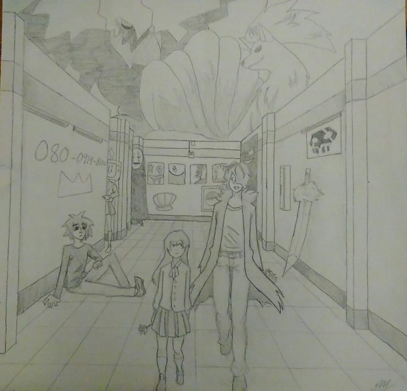
In this piece, there are many artist who I was inspired by. I love the Gorillaz and the music they make, and it usually influences the tone of my art when I listen to their music. I'm also inspired by multiple manga artist such as Adachitoka, the author of "Noragami" and Tite Kubo, the author of "Bleach". They influence me because I strive to one day be as good at art as they are, and they give me motivation to pick up my pencil and keep drawing until I make it.
What is similar about the work you made and the artist that inspires it?"
For the Gorillaz, I had drawn their "lead singer" sitting up against the wall and tried to match the style that he's usually drawn in (the Gorillaz are a band made up of animated characters). However, with the rest of the piece, I had just used some character designs and symbols from different media that I enjoyed, and drew them in my style, so the inspirations from the other artist may shine through in my style a bit, but they mainly just motivate me to keep drawing.
"Do you think the artists would like your work?"
Oh man, I hope so. Honestly I look at this now and realize I've improved a little bit from then to now and could probably redraw this piece and it would turn out better. But if the artists did see my piece, I might be embarrassed, but I would strongly hope that they would like it. At the least, I hope that they would encourage me to keep practicing and encourage me to get better.
Aesthetics

Lost
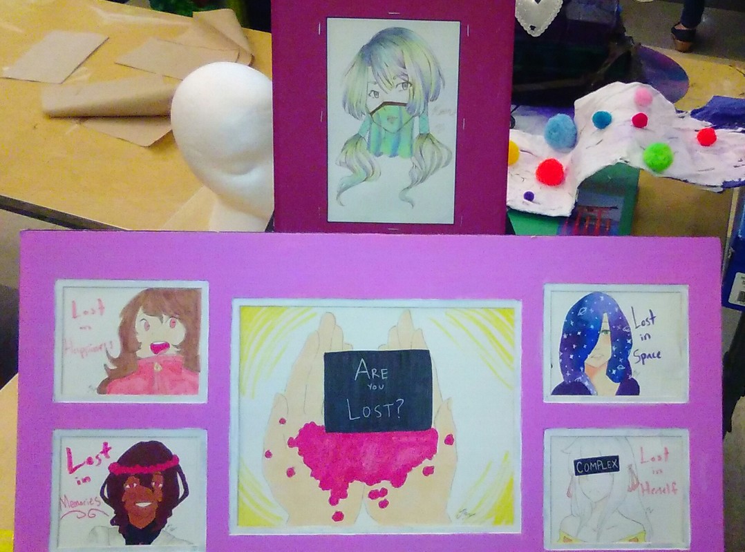
The subject of my aesthetics assessment is my Mashup, Lost.
Production
Mashup
"Lost"
By Jenna Maney
For my mashup, I wanted it to be a mashup of my artwork that I had done, depicting my characters and their thoughts, the art I enjoy to make, and the stories that I want to create with these characters in the time span we had to finish this project, so I decided to get two frames- one for a stand-alone piece, which is the picture in the single frame at the top, and one for multiple related pictures of my own original characters, which is the frame with multiple sections at the bottom of the work. Now, I would like to explain this work, starting with the stand-alone piece at the top. The piece is indeed of one of my characters, but she is not related to the characters or story that is depicted at the bottom of the piece. In this stand-alone drawing, I just wanted to create a piece with colors that are pleasing to look at, and I wanted it to look graceful because in most of my art I like the characters to flow and I enjoy making smooth and graceful lines, so that was the main point I had wanted to convey in that piece. In the bottom frame, I had again thought about how I wanted the colors of the characters to look, as over the years in my art, I have come to enjoy creating color schemes that make sense and look pleasing to the eye. As for the text in the bottom frame, I had wanted to convey the deeper thoughts of each of my characters and each of their individual struggles as a contrast to their usual eccentric and somewhat “wacky” personalities. So, as seen in the piece, one character is lost in his memories from long before. Another one is lost in herself, only thinking about herself. The girl in the top left is lost in her happiness, therefore being desensitized to others struggles. The last character is lost in “space”, not knowing who she is or what she wants to do with her life yet. I tried to convey meaning in this piece, and used characters that are very close to my heart and who I care deeply about, especially the girl in the top right corner, she is a character who I have had for about as long as I have been drawing, and she is very close to my heart and, as with all my characters, have enjoyed seeing evolve over the years.
Some elements of art I tried to add in was space, so that the pictures didn't completely overwhelm the viewer. I also tried to use color to my advantage by trying to create nice color schemes with colors that would go nicely together and complement each other. I used line in a way where I tried to convey the feeling of flow and grace in each piece. For shape, I tried to use soft shapes mostly that had somewhat smooth edges, to again evoke a feeling of flow. I'm not all that great at texturing pieces, but I believe that the hair, especially on the top piece, shows some texture. The form of the piece is there to convey sort of my "art journey" in a way by showing off my art and characters set in frames. I tried to add balance in the piece by placing the frames in a way that the piece would look symmetrical and balanced. As for variety, I don't believe there is a lot, mainly because it is all in one style, which is my usual art style, and the fact that I'm only depicting humans. I used pattern in the bottom piece by repeating a common theme in the wording near each picture. In the piece, I wanted to put emphasis on the red flowers shown in the hand and on my character's head. I tried to add proportion by again making the whole piece symmetrical, but I also made sure to pay attention to the way I drew the people so that their proportions wouldn't look unnatural. Again, the main contrast I tried to put in the piece was the bright red flowers in the bottom portion.
